
Spanish/English
Cuando queremos planear un evento, cuando queremos decorar una estancia o mismamente cuando queremos elegir un outfit, el color está presente.
When we want to plan an event, when we want to decorate some parts of our house or simply when we would like to choose our perfect outfit, the colour is present in those decisions.

El color está a todos lados y gracias a la manera en la que nuestra mente está configurada, solemos asociar los colores con un sentimiento, estado de ánimo… en definitiva los colores nos transmiten emociones.
Colour is everywhere, no doubt, and thanks to the way our mind is formed, we tend to associate colour with a feeling, a mood… in other words, certain colours make us feel a certain way!
Apoyándonos en este hecho, podríamos aventurarnos a señalar que la elección de colores es una cuestión importante en cualquier diseño que persigamos. Y esto es algo que a primeras no nos planteamos, o que simplemente pensamos que no tiene tanta importancia. Pero lo que no sabemos es que, una buena combinación de colores les dará a nuestras celebraciones o estancias un estilo único y propio.
Supporting this aspect, we could note the importance of choosing our colour selection in any design we want to pursue. This is something that we do not stop to think about in the first instance, or we just think that it is not that important, that this decision can be made afterwards. We merely know that the correct choice of colour will give our home or event, the unique essence needed.
Vayamos por partes…
Let’s go step by step
Para nuestro hogar, existen varios factores que afectan a la hora de esta elección, espero que después de leer estas pequeñas ayuditas que he seleccionado, encontréis más fácil las opciones de color para vuestro hogar.
For our home there are multiple factors that could affect the moment of this decision. I am hoping that after reading these tips, you could discover an easy way to make your choices
El espacio/ The space
Como la mayoría sabemos las dimensiones de una habitación influyen de manera considerable. Si el espacio es pequeño deberemos aplicar tonalidades de color que nos ayuden a verlo más amplio. No elegir colores intensos y optar por aquellos que sean más fríos.
As we all may be aware, the room dimensions have a huge influence. If the space is small, we shall apply those tones that help us to perceive the room as larger. Avoiding intense colours and opting for those that are colder.
La luz/the light
Sin lugar a duda la luz juega uno de los papeles más importantes a la hora de elegir nuestros colores. El sol durante el día, nos ayudará a poder elegir aquellos más oscuros y fríos. Pero si por el contrario nuestra estancia no recibe la luz natural que tanto deseamos, necesitaremos tener en cuenta los más cálidos y pálidos que nos reflejen esa luz que nos falta.
Light plays an extremely important role, the sun during the day will help us to choose those tones that are darker or colder. On the contrary, if the room does not receive enough natural light, we need to count on warm and pale colours to be able to provide the lack of light.
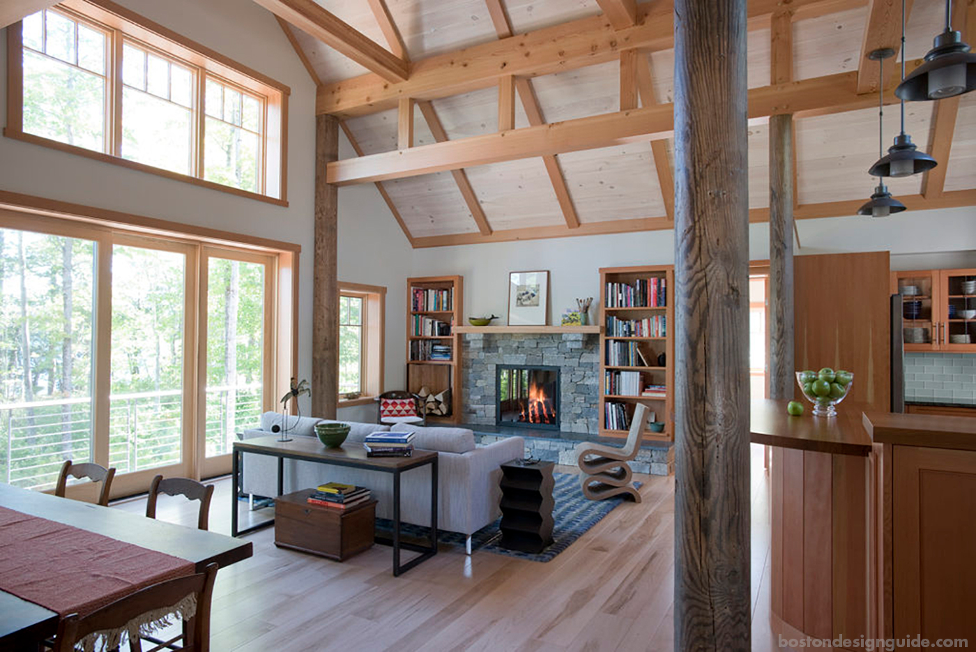
Design and engineering: Bensonwood; windows by Marvin Windows; photography by James R. Salomon
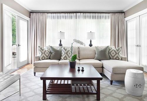
La estancia/ The living rooms
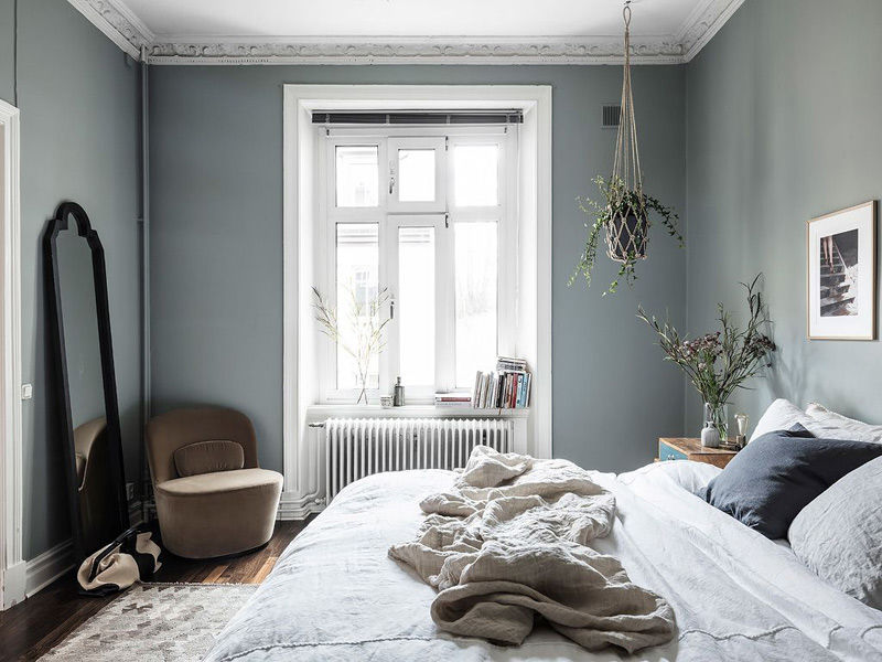
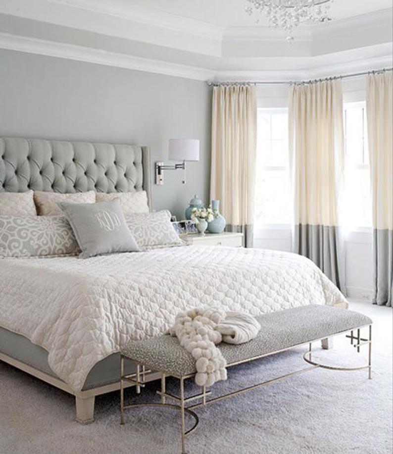
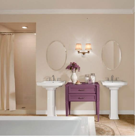
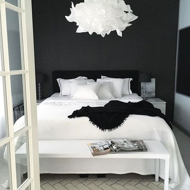
No es lo mismo decorar nuestra cocina que nuestro dormitorio, eso lo sabemos todos, por ello debemos tener claro el propósito o el uso que queremos darle a cada una de las estancias de nuestro hogar. Para un dormitorio, lo ideal es elegir aquellos colores relajantes; azul, gris, rosa pálido o verde suave.
It is not the same to decorate a kitchen and a bedroom, as we all know, for this reason we should have in our mind with what purpose the room will be designed for. In a bedroom the ideal choice would be to have those colours that contribute to a relaxing and calm state: light blue, grey, pale pink.


El tipo de pintura/ Type of paint
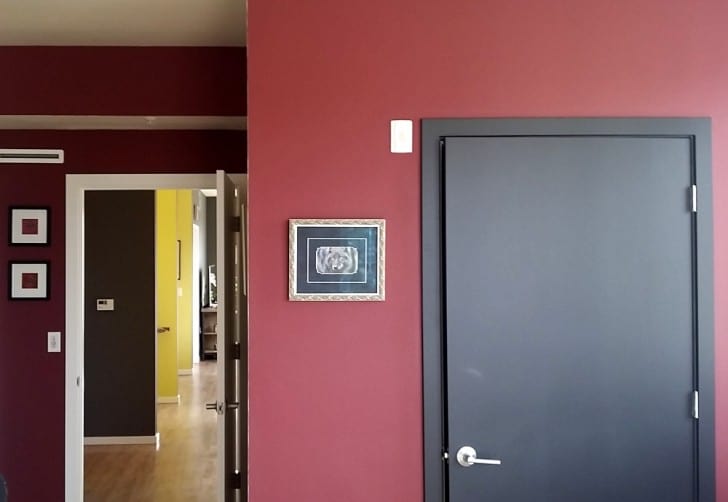
La elección de la pintura en las paredes es otro tema a considerar, que pasa bastante inadvertido. Las pinturas mates son recomendadas para aquellas paredes con algún tipo de defecto que te ayudará a disimularlo de una manera más sutil. Mientras que las brillantes “gloss” irán perfectas para una pared lisa y sin imperfecciones.
The Paint choice is another topic to be considered, something that goes unnoticed by our decisions. The matt paints are recommended for those walls with some imperfections that will help to disguise them in a subtle way.
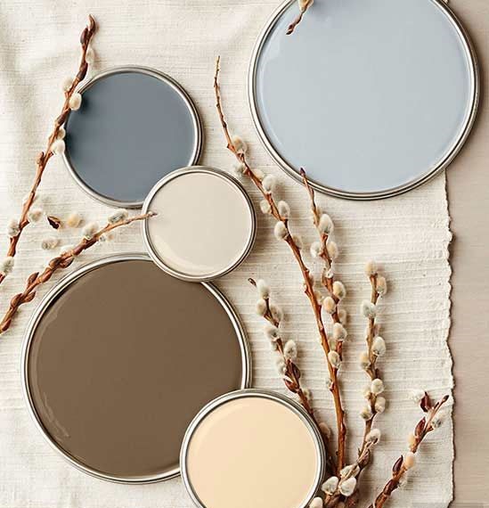
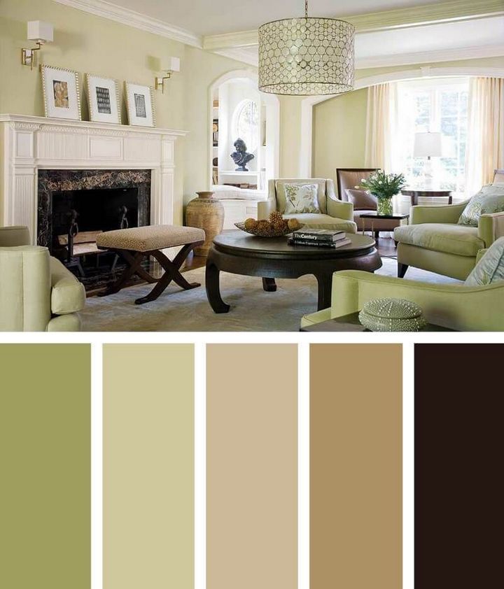
Después de este análisis necesitamos mirar muestras y elegir colores que combinen entre sí. La cantidad de combinaciones de colores es infinita y podemos sentirnos abrumados en ciertas ocasiones por ello debemos recordar que la elección debe ser con la que nos sintamos siempre más cómodos y seguros.
After this scrutiny, we need to look at examples and chose colour that can be combined with each other. The range of combinations is never ending and we may overwhelm ourselves on some occasions. Due to this, we need to consider those which we feel more comfortable and secure.
Con una paleta de color monocromático usaremos diferentes tonos de un mismo color, donde el tono más claro estará en la superficie más grande. Es una buena apuesta para conseguir un ambiente sosegados y tranquilos, como nuestros dormitorios, donde buscamos unidad.
Monochromatic palette, we will use different tones of the same colour, where the lighter one will be in the biggest surface. It is a good move to achieve a quiet environment, like our bedrooms where we look for unity.
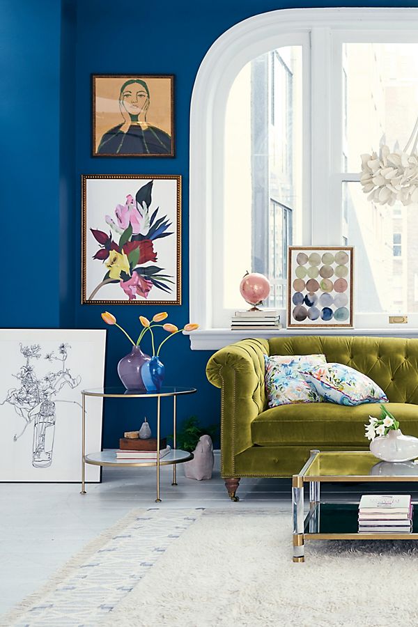
Paleta de color complementario aquellos colores opuestos en la rueda de color que nos darían un efecto más llamativo. Esto puede servirnos para cocinas o cuarto de los peques…
Complementary palette, those colours that are opposite to each other and will give us the most striking effect. This could be applied in a playroom, kitchen…
Paleta de colores análogos, estos crean armonías ideales para otras estancias que necesitan conformidad como un estudio/biblioteca o sala de estar. Estas paletas de colores son también las más demandadas por los grandes eventos como las bodas, con la que también intentaré daros algunas tips en los próximos días
Analog Palette, these colour create ideal harmony for those rooms that need that matching effect, like a study, library or even your lounge. These colours are also in demand for events like weddings or big parties which I will posting more tips on soon!

La paleta de Colores neutros: sin duda de los más demandados, aquellos que contienen el blanco o negro para nuestros fondos, donde crearemos una base. Después se puede hacer un añadido con colores más intensos dándole así más vida a nuestra estancia.
Neutral Palette, the most demanding ones, those that contain black or white in the background and a base is created. We can then add small touches of intense colour to give more life to the room.
Colores acromáticos combinación entre el blanco, negro y gris. Esto puede darnos una sensación de vacío, por ello es bueno combinarlos con colores cromáticos.
Achromatic palette a combination between White, black and grey, (my favourites if I am honest). This sometimes, can give us an empty feeling when we enter in a room however we can always complement these colours with the chromatic palette.

Espero que estos consejos hayan servido de algún tipo de ayuda, estas decisiones siempre llevan su tiempo. Gracias por leer,
I hope this tips have been useful and helpful! As mentioned above, these decisions always take time. Thanks for reading
Any more ideas? Would you like to share them? Please leave your comment or email me theenglishbathgarden@gmail.com
